


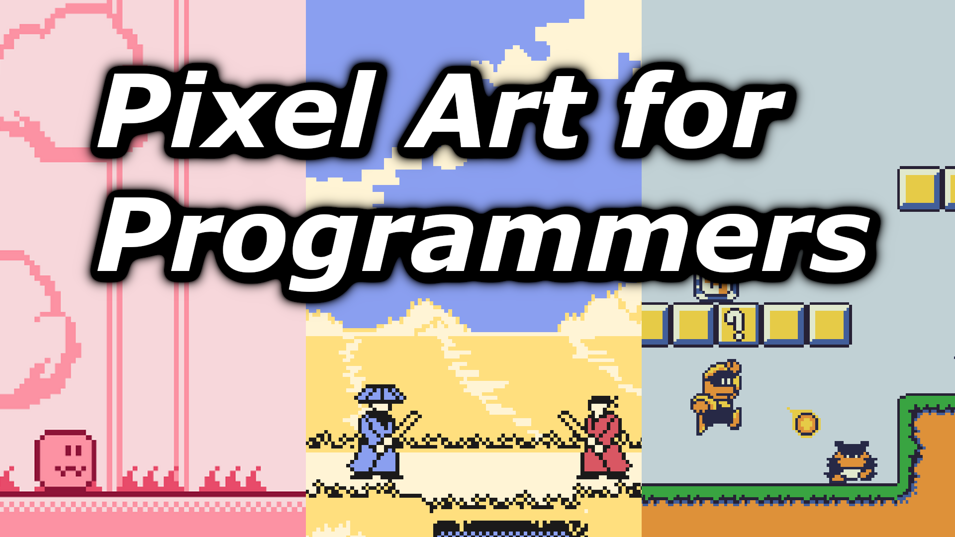
5 Pixel Art Tips for Programmers

Programmers are known to not have a strong suit for art related disciplines, pixel art is no exception. In this post, I’ll share 5 tips for making good pixel art from the point of view of a programmer. This is to help other solo devs coming from a programming background to make better pixel art for their games.
Now, you might be wondering if I’m qualified to share tips related to pixel art? Below are two pixel art asset packs I made. If you like how they look, then the question is answered.


Here are all the asset packs I’ve made so far :
Tip #1 : Nurture Good Taste in Pixel Art
How do you know if a sprite looks good or not? You might have assumed that you just need to look at it and your brain determines whenever it’s appealing or not. Maybe the colors clash or the pixels are not placed symmetrically, etc… all things that you should detect naturally.
However, it’s not that simple, an art piece can go against commonly held rules and still look good. It can look good to one person but not to another.
While whenever a sprite or any piece of art looks good can be subjective to an extent it’s undeniable that some of them look good to a majority of people.
This subjective nature of art is what a lot of programmers struggle with. You might be used to having a compiler compile and run your code. If your code successfully runs then you know that at least your code works.
With art though, you need to acquire good taste that will effectively act as your own internal compiler when doing pixel art. It will guide you during your art process and allow you to realize when things don’t work (ex: Color clashes, etc…).
The question now becomes, how do you develop good taste in pixel art? The simplest way is to look at well regarded pixel art online. It can come from games where the art is praised or from pixel artists online. When observing each pieces, try to notice the details. If you do this enough, you’ll build an internal understanding of what makes good pixel art.


Tip #2 : Don’t Draw! Negotiate Your Pixels Instead
If you come to pixel art with the mindset that you’re going to draw what you want like you would on pen and paper, you’re going to get frustrated. Pixel art at low resolutions is all about negotiating with your canvas.
It’s basically a puzzle game. You need to figure out where to place your pixels to represent what you want while still compromising on certain details.
The sooner you view pixel art like this, the less you’re going to struggle drawing the sprites you need for your games. This is because you’re now more flexible and ready to adapt when representing certain things that are challenging at low resolutions.
Tip #3 : Reference Other Pixel Art as Much as Possible
You can either do the hard work of figuring out how to represent an object or character in lower resolution or you can go look at the million of available game sprites that already solved what you’re trying to represent.
That’s why I recommend using references extensively.
For example, if you want to make a top-down action adventure game a la Zelda there is no shame in looking up link’s sprites to see how he’s represented or how his sword attack animations are made.
In case you didn’t know, the most comprehensive website for looking up sprites from various retro games is The Spriters Resources.

Tip #4 : Stick to a Limited Color Palette but Expand it If Needed
Sticking to a limited color palette is very important in pixel art due to the low amount of space available. Every color you choose will have a big impact on the appeal of the final sprite.
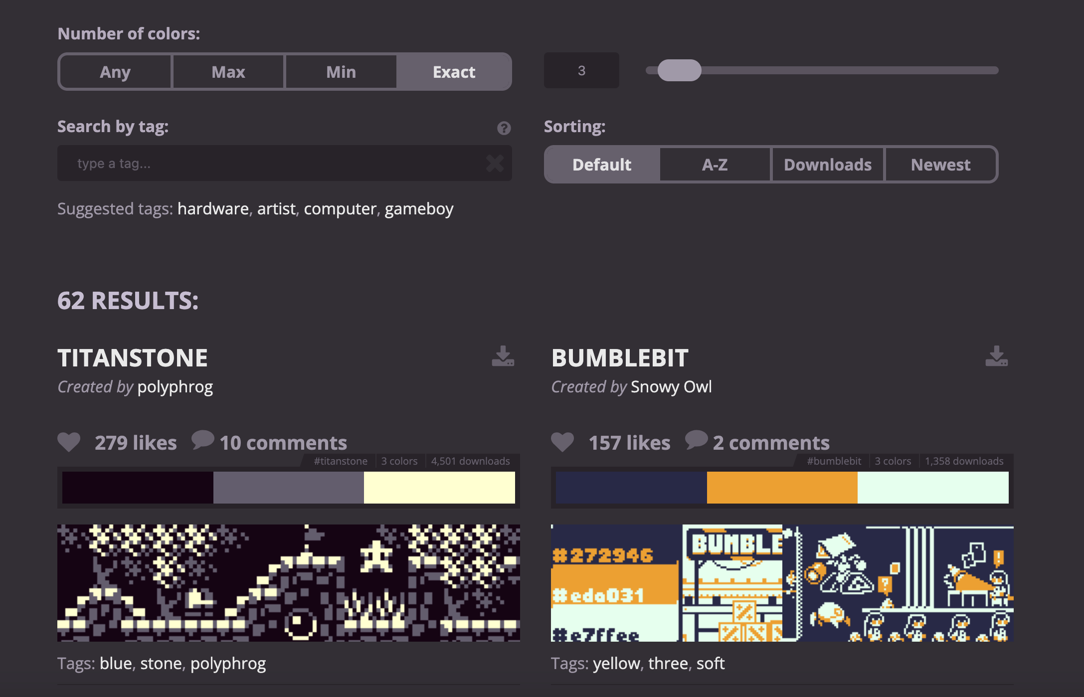
If you don’t want to deal with color theory, you can always pick an existing color palette. There is this website called Lospec with plenty of color palettes you can pick from. On the website, you can often see pixel art examples using the listed color palette. This will help you determine if the palette fits with what you want to do.
Another option consists in finding a pixel art piece you like online and picking the same colors to make your palette.
Finally, when working with limited color palettes, you might feel too constrained. It can occur that the colors you have in your palette are not enough. In that case, I recommend adding a color to your existing palette.
In fact, it’s much easier to expand a given color palette one color at a time then to not limit yourself to a palette first and choose colors on the fly. When you need a new color, you can more easily compare your new color choice with the existing palette and see if it fits and change your choice if not.
Tip #5 : Constraints Breeds Creativity and Hides Your Flaws
I often hear the phrase “Constraints breeds creativity” and I agree because when constrained you often end up finding creative solutions. However, another lesser known benefit of constraints is that they allow you to hide your flaws.
The less constraints you have, the more ambitious you get, the higher the likelihood of going out of your comfort zone and finding yourself in an area where you do not have enough skill to pass the “professional” quality bar.
For example, if you’re someone with very limited coloring skills. I would recommend sticking to a prefined color palette of max 4 colors. This way, you can more easily reach a “professional” looking result compared to if you had to pick your own colors.
Well chosen constraints allows you to put forward your strengths while hiding your flaws. Another way to put it would be that constraints reduces the likelihood of shooting yourself in the foot.
Conclusion
While I hope these tips will help you make better pixel art, it’s no secret that practice remains a big part of what you need to do achieve good results.
If you’re interested in reading more posts like this. I recommend subscribing to my Substack as to not miss out on future releases.
In the meantime, you can check out my previous post.
