
Learn React.js by Building a Game Search App | Part 3/3 - Finishing The App


In the previous part (Here are links to part 1 and part 2), we finished setting up the logic to fetch data from our backend. Now it’s time to display the data in a nice looking UI.
Table of Contents
Creating The Game Card Component

After the user makes a search, we want to display a list of relevant games that will be rendered as a grid of cards where each card contains the game’s title, genres, cover image and the time it takes to complete the game if the data is available.
The first step to achieve this is to build a reusable game card component. Inside the components folder, create a file called GameCard.jsx.
src
|- components
      |- GameCard.jsx
Within that file, add the following code :
export default function GameCard({
  coverLink,
  name,
  playtime,
  genres,
  onClick,
}) {
  return (
    <div className="flex-col relative" onClick={onClick}>
      <img
        src={coverLink}
        loading="lazy"
        className="w-full h-40 object-cover rounded-md"
      />

      <h1 className="p-2 text-gray-300 text-lg">{name}</h1>
      {playtime !== 0 && (
        <div className="flex items-center gap-2 mx-2 bg-gray-800 p-2 absolute top-2 right-0 rounded-md">
          <img
            src="./clock-fill.svg"
            className="text-gray-300 max-w-xs max-h-xs"
          />
          <p className=" text-gray-300 text-sm whitespace-nowrap">
            {playtime} Hours
          </p>
        </div>
      )}

      <li className="flex flex-row flex-wrap gap-2 m-2 mt-auto">
        {genres.map((genre) => (
          <ul className="genre-pill" key={genre.name}>
            {genre.name}
          </ul>
        ))}
      </li>
    </div>
  );
}
We create a component with 5 props.
coverLink: The link of the cover image.name: The name of the game.playtime: How long the game takes to beat.genres: An array containing the game’s genres.onClick: A function that will run when the user clicks on a card.
Let’s break down the JSX returned by the component.
<div className="flex-col relative" onClick={onClick}>We the return a div that acts as the card container. We set is as a flex container and make it relative so that within, we will be able to place the playtime indicator at the top-right of the card using absolute positioning. We then set the onClick function passed as a prop to trigger when the container is clicked.
<img
  src={coverLink}
  className="w-full h-40 object-cover rounded-md"
/>
We display the game’s cover using a simple img tag. First, the image is set to take the full available width with w-full . The height is set to 40 Tailwind units using h-40.
The object-cover Tailwind class is used to render the image in its original aspect ratio while still fitting within the width and height of the img tag. rounded-md stands for rounded medium and makes the corner of the image noticeably rounded.
<h1 className="p-2 text-gray-300 text-lg">{name}</h1>This h1 tag is used to display the game’s name.
{playtime !== 0 && (
        <div className="flex items-center gap-2 mx-2 bg-gray-800 p-2 absolute top-2 right-0 rounded-md">
          <img
            src="./clock-fill.svg"
            className="text-gray-300 max-w-xs max-h-xs"
          />
          <p className=" text-gray-300 text-sm whitespace-nowrap">
            {playtime} Hours
          </p>
        </div>
)}
We use conditional rendering to render the playtime indicator only if the playtime is above 0 hours. Usually, if it’s 0 then that means the playtime data for this game isn’t available. The RAWG API returns 0 in that case.
Using absolute positioning we’re able to place the indicator at the top-right corner of the game card by using absolute top-2 right-0.
Conditional Rendering in React
There are many ways to achieve conditional rendering in React. Here are a few examples.
First example with an if statement.
function myComp() {
  if (condition) {
    return (
      <div>
        <h1>B</h1>
      </div>
    );
  }

  return (
    <div>
      <h1>A</h1>
    </div>
  );
}
Second example with a boolean expression.
function myComp() {
   return (
     <div>
       {condition && <h1>B</h1>}
       {!condition && <h1>A</h1>}
     </div>
   );
}
Third example, with a ternary operator.
function myComp() {
   return (
     <div>
       {condition ? <h1>B</h1> : <h1>A</h1>}
     </div>
   );
}
If you want to achieve conditional rendering within JSX you can’t use an if statement and are forced to use either a boolean expression or a ternary operator. Between using a boolean expression or a ternary operator in the example above, the latter is better since we display “B” in the case the condition is true and “A” otherwise.
{playtime !== 0 && (... rest of the code)}However, in our game card component we display the playtime indicator only if its value is above 0 and nothing otherwise. Therefore, the boolean expression is more fitting for our use case.
<li className="flex flex-row flex-wrap gap-2 m-2 mt-auto">
 {genres.map((genre) => (
    <ul className="genre-pill" key={genre.name}>
      {genre.name}
    </ul>
  ))}
</li>
Finally, we display the genres of the game. There can be more than one, that’s why we’re rendering this section as a list of items. Now has come the time to understand how lists are rendered in React.
Note that the class genre-pill is a custom class and you need to add it to your index.css file for it to work.
.genre-pill {
  @apply bg-red-800 rounded-full px-2 text-gray-300 text-sm;
}
How to Render Lists in React
It often occurs when working on Web UIs that you want to render multiple elements at once. For example, you want to render a list of search results, in our case, a bunch of game cards.
In React, you can achieve this by using the JavaScript .map function to iterate over an array and for each element return some JSX. At a basic level, it looks like this.
function myComp() {
  const lines = ["Hello World!", "Foo", "Bar"];

  return (
    <ul>
      {lines.map((line) => <li>{line}</li>)}
    </ul>
  );
}
{lines.map((line) => <li>{line}</li>)}However, there is something missing in the code above. When rendering multiple elements, the rendered JSX elements need to be assigned a key. This is to enable React to establish a relationship between array elements and the corresponding JSX element. This becomes very important if items of the list are later added or removed. The key enables React to make the correct updates to the DOM.
You might come across React code using the index of the element as the key.
{lines.map((line, index) => <li key={index}>{line}</li>)}This is to be avoided when the array can change later down the line. For example, if the elements of the array are sorted in a different order, the relationship between the index and the JSX element will be broken.
To avoid this from happening, it’s usually best to use a consistent but unique key. Consistent in the sense that the key doesn’t change from render to render and unique so that no two elements in the list have the same key.
In our example above, the only key that would best fulfill these two conditions are the lines themselves.
{lines.map((line) => <li key={line}>{line}</li>)}If we assume that the data you want to display comes from a source that you control, you could have decided to assign a unique id for each item before sending the data to the client.
For example, let’s assume that each line of our lines array will have an id. You would have something like this :
[{id: "u90909dfj89", content: "Hello World"}, ...]You would use the id as the key.
{lines.map((line) => <li key={line.id}>{line.content}</li>)}Alternatively, with destructuring you would do :
{lines.map(({id, content}) => <li key={id}>{content}</li>)}For our genres, since the genre name is unique, we use the name for both the content of the list item and the key.
Rendering a List of Game Cards
Now that we have finished the game card component, let’s use it in App.jsx to display relevant games when the search feature is used.
Add the following code :
// previous code omitted for clarity
import GameCard from "./components/GameCard";

export default function App() {
  // previous code omitted for clarity

  const { data, loading, fetchData, error, reset } = useFetch(() =>
    fetchGames({ query: searchQuery })
  );

  // code omitted for clarity

  // second useEffect is no longer needed. This was just for testing purposes
  // useEffect(() => {
  //  if (data) console.log(data);
  // }, [data]);

  return (
    <main className="w-full p-2 flex flex-col items-center">
      {/* code omitted for clarity */}
      <div className="w-full max-w-4xl">
        <Search
          query={searchQuery}
          onChange={(e) => setSearchQuery(e.target.value)}
        />
        <div className="w-full">
          {data && (
            <div className="grid grid-cols-1 gap-5 sm:grid-cols-2 lg:grid-cols-3">
              {data.results.map(
                (game) =>
                  game.added > 30 && (
                    <GameCard
                      key={game.slug}
                      name={game.name}
                      coverLink={game.background_image}
                      playtime={game.playtime}
                      genres={game.genres}
                      onClick={() => {
                        console.log("test");
                      }}
                    />
                  )
              )}
            </div>
          )}
        </div>
      </div>
    </main>
  );
}
Let’s break it down.
{data && (
  <div className="grid grid-cols-1 gap-5 sm:grid-cols-2 lg:grid-cols-3">
    {data.results.map(
      (game) =>
        game.added > 30 && (
          <GameCard
            key={game.slug}
            name={game.name}
            coverLink={game.background_image}
            playtime={game.playtime}
            genres={game.genres}
            onClick={() => {
              // TODO
              console.log("test");
            }}
          />
         )
       )}
  </div>
)}
We only render the game cards if the data is available. In that case, we first render a div which acts as a container for all game cards and is going to be displayed as a CSS grid.
grid grid-cols-1 gap-5 sm:grid-cols-2 lg:grid-cols-3grid: sets thedivas a grid container.grid-cols-1: sets the grid to have 1 column only.gap-5: sets a gap of 5 units between each elements in the grid.sm:grid-cols-2: sets the number of columns of the grid to be 2 on smaller screens and beyond.smis a media query in Tailwind.lg:grid-cols-3: sets the number of columns of the grid to be 3 on larger screens and beyond.lgis also a media query in Tailwind.
{data.results.map(
  (game) =>
    game.added > 30 && (
      <GameCard
        key={game.slug}
        name={game.name}
        coverLink={game.background_image}
        playtime={game.playtime}
        genres={game.genres}
        onClick={() => {
          // TODO
          console.log("test");
        }}
      />
    )
  )
}
We get the game cards data by doing data.results which returns an array. We then map over it to render each game card.
Before rendering a game card we make sure that the game has been added at least more than 30 times. The reason we’re doing this is that the RAWG API has the added property which determines how much a game was added. It doesn’t specify what added is exactly but I’ve noticed that if you just render what ever the array has you’ll often find yourself displaying cheap fangames and clones along side more legit titles. To show the best quality results as possible, I have figured out through testing that a game must have been added at least 30 times to be considered “legit”.
As mentioned previously when rendering an array in React you must provide a key for each element. Here is no exception. However, you might be wondering if we have to define a prop called key on the GameCard component before passing to it a key since it’s custom made and not a native JSX element? Fortunately, you don’t have to, it’s taken care of automatically by React.
Since the RAWG API returns a slug for each game, this will act as our unique key since it never changes for a specific game and is unique.
Now that we have added our game card list rendering logic, let’s test it out. Make sure to have your backend and frontend running with node index.js and npm run dev respectively.
You should have the following results.
Handling Edge Cases and Improving The User Experience
While we were able to successfully display relevant results when a user makes a query there are still edge cases we aren’t handling.
Displaying Error Messages in The UI
For example, what should be shown to the user if there are no games relevant to what they searched for?
In that case nothing is shown which isn’t a great user experience. To fix this, let’s add a message that will be displayed when no relevant search results are found.
Modifiy the code we had previously like shown below.
<div className="w-full">
  {data && (
    <>
      <div className="grid grid-cols-1 gap-5 sm:grid-cols-2 lg:grid-cols-3">
        {data.results.map(
          (game) =>
            game.added > 30 && (
              <GameCard
                key={game.slug}
                name={game.name}
                coverLink={game.background_image}
                playtime={game.playtime}
                genres={game.genres}
                onClick={() => {
                  console.log("test");
                }}
              />
          )
        )}
       </div>
       {data.results.length === 0 && (
         <div className="w-full flex flex-col justify-center items-center">
           <img src="./no-results-found.png" className="size-52" />
           <p className="text-gray-300 text-2xl">No games found!</p>
         </div>
        )}
    </>
  )}
</div>
<></> is called a React fragment. This is useful when you don’t want to create an unnecessary div to wrap two or more elements at the same level. In our case we want the JSX for the search results and the JSX for the “No games found!” message to be both children of the container div having the className w-full. There is no need to wrap them under an additional div.
Now let’s test things out.
As you can see, the message showed up.
There’s still another edge case we haven’t taken into account. What if, for some reason, the app fails to retrieve data from the backend? Currently we show nothing in that case. However, the wise thing to do is to have some kind of error message displayed to the user.
Since this error message is going to have the same structure as the one we used for the “No games found!” message, let’s create a reusable component in the components folder. Create the file ErrorMessage.jsx with the following code.
export default function ErrorMessage({ message }) {
  return (
    <div className="w-full  flex flex-col justify-center items-center">
      <img src="./no-results-found.png" className="size-52" />
      <p className="text-gray-300 text-2xl">{message}</p>
    </div>
  );
}
Now, we can use this component in App.jsx. Import the ErrorMessage component at the top of the file.
import ErrorMessage from "./components/ErrorMessage";Then, replace the JSX we used for the “No games found!” message.
From :
{data.results.length === 0 && (
  <div className="w-full flex flex-col justify-center items-center">
    <img src="./no-results-found.png" className="size-52" />
    <p className="text-gray-300 text-2xl">No games found!</p>
  </div>
)}
to :
{data.results.length === 0 && (
  <ErrorMessage message={"No games found!"} />
)}
Let’s use the same component to display an error message when the apps fail to retrieve the data from the backend.
// previous code omitted for clarity
<div className="w-full">
  {data && (...)}
  {error && <ErrorMessage message={"Network Error Occured!"} />}
</div>
Now, when a network error occurs, you’ll get the following UI.

Adding a Loading Spinner
Another thing to improve upon is the fact that we give no indication to the user that the app is loading search results. Let’s add a spinner so that user doesn’t think the app has crashed.
Under the components folder create a file called Spinner.jsx and add the following code :
export default function Spinner() {
  return (
    <div role="status">
      <svg
        aria-hidden="true"
        className="w-8 h-8 text-gray-200 animate-spin dark:text-gray-600 fill-blue-500"
        viewBox="0 0 100 101"
        fill="none"
        xmlns="http://www.w3.org/2000/svg"
      >
        <path
          d="M100 50.5908C100 78.2051 77.6142 100.591 50 100.591C22.3858 100.591 0 78.2051 0 50.5908C0 22.9766 22.3858 0.59082 50 0.59082C77.6142 0.59082 100 22.9766 100 50.5908ZM9.08144 50.5908C9.08144 73.1895 27.4013 91.5094 50 91.5094C72.5987 91.5094 90.9186 73.1895 90.9186 50.5908C90.9186 27.9921 72.5987 9.67226 50 9.67226C27.4013 9.67226 9.08144 27.9921 9.08144 50.5908Z"
          fill="currentColor"
        />
        <path
          d="M93.9676 39.0409C96.393 38.4038 97.8624 35.9116 97.0079 33.5539C95.2932 28.8227 92.871 24.3692 89.8167 20.348C85.8452 15.1192 80.8826 10.7238 75.2124 7.41289C69.5422 4.10194 63.2754 1.94025 56.7698 1.05124C51.7666 0.367541 46.6976 0.446843 41.7345 1.27873C39.2613 1.69328 37.813 4.19778 38.4501 6.62326C39.0873 9.04874 41.5694 10.4717 44.0505 10.1071C47.8511 9.54855 51.7191 9.52689 55.5402 10.0491C60.8642 10.7766 65.9928 12.5457 70.6331 15.2552C75.2735 17.9648 79.3347 21.5619 82.5849 25.841C84.9175 28.9121 86.7997 32.2913 88.1811 35.8758C89.083 38.2158 91.5421 39.6781 93.9676 39.0409Z"
          fill="currentFill"
        />
      </svg>
      <span className="sr-only">Loading...</span>
    </div>
  );
}
This component is based upon the loading spinner example found here. Most of it is SVG code. I will not explain how SVG work because it’s out of the scope of this tutorial. Let’s just use that spinner as is in our app.
In App.jsx, add the following code :
// previous code omitted for clarity
import Spinner from "./components/Spinner";
Then, modify our existing code where we display the search results :
<div className="w-full">
  {!loading ? (
    <>
      <div className="grid grid-cols-1 gap-5 sm:grid-cols-2 lg:grid-cols-3">
        {data?.results.map(
          (game) =>
            game.added > 30 && (
              <GameCard
                key={game.slug}
                name={game.name}
                coverLink={game.background_image}
                playtime={game.playtime}
                genres={game.genres}
                onClick={() => {
                  console.log("test");
                }}
              />
            )
         )}
       </div>
       {data?.results.length === 0 && (
         <ErrorMessage message={"No games found!"} />
       )}
    </>
   ) : (
    <div className="flex justify-center">
      <Spinner />
    </div>
  )}
  {error && <ErrorMessage message={"Network Error Occurred!"} />}
</div>
You’ll notice that we now have a ternary operator that determines whenever or not to show the spinner. If we aren’t in a loading state we render the grid or the error message. We use data? with the question mark as to only attempt to access the results property of the data object if it’s available.
Now, let’s test it out.
Building The Game Details Component

The final part of this project consists in building the game details component which is a component that will display a dedicated section for a specific game after having clicked on its game card. In a production app, you would probably use a router like React Router and make it display as its own separate page.
However, I wanted to limit the use of third-party libraries, so I opted for displaying a component on the same page instead.
Creating a New API Endpoint to Fetch More Data
Before we build that component, we need to write a new API endpoint in our backend to fetch data specific to a game. This endpoint will return a detailed description of the game. This wasn’t provided by the previous endpoint we had.
In your backend, add the following endpoint to your index.js file.
app.get("/api/game", async (req, res) => {
  const { gameSlug } = req.query;

  try {
    const response = await fetch(
      `https://api.rawg.io/api/games/${gameSlug}?key=${API_KEY}`,
      {
        method: "GET",
        headers: {
          "Content-Type": "application/json",
        },
      }
    );

    if (!response.ok) {
      throw new Error("Failed to fetch data from external API");
    }

    const data = await response.json();

    return res.json(data);
  } catch (error) {
    console.error("Error fetching data from API:", error);
    return res
      .status(500)
      .json({ error: "Failed to fetch data from external API" });
  }
});
The first API endpoint returns, amongst other things, the game’s slug which we can use to query this second endpoint by passing it as a param.
Now restart the backend by doing Ctrl+C and running the command node index.js. Then, in our frontend, in the api.js file, add the following code :
// previous code omitted for clarity

export async function fetchGameData({ gameSlug }) {
  const response = await fetch(`${API_ENDPOINT}/game?gameSlug=${gameSlug}`);
  return await response.json();
}
Finally, in the components folder, create a new file called GameDetails.jsx and add the following code.
import { useEffect } from "react";
import useFetch from "../hooks/useFetch";
import { fetchGameData } from "../api";

export default function GameDetails({ currentGame, goBack }) {

   const { data, loading, fetchData, error, reset } = useFetch(() =>
     fetchGameData({ gameSlug: currentGame.slug })
   );

   useEffect(() => {
    (async () => {
      await fetchData();
    })();
   }, []);


   return (<section></section>);
}
We started things simple, by writing the logic to fetch the relevant data as soon as the component is rendered. We pass two props to the component. currentGame which is an object that contains the data previously fetched for a specific game. It contains the game’s slug (which is its id), genres, title, etc… We use the slug to fetch more data (the game’s detailed description).
The second prop is a function used to enable the user to go back to the search results if they wish to do so. Like mentioned earlier, in a production app, use something like React Router so that the user can use the back button of their browser to go back. This is called navigation and isn’t built into React by default, underlining the need for a third party library.
Our backend will return a description of the game and is formatted as a single long string. If we render it as is, it will not look good in the UI. That’s why we need to add the following utility function. Place it above where the GameDetails component is defined.
// import statements should be here

function createParagraphs(inputString) {
  // Split the string into sentences using regex to match sentence-ending punctuation (., !, ?)
  const sentences = inputString.match(/[^.!?]+[.!?]+/g) || [];

  // Initialize an array to hold the paragraphs
  const paragraphs = [];

  // Loop through the sentences and create paragraphs with a max of 3 sentences
  for (let i = 0; i < sentences.length; i += 3) {
    // Join the next 3 sentences to form a paragraph
    const paragraph = sentences
      .slice(i, i + 3)
      .join(" ")
      .trim();
    paragraphs.push(paragraph);
  }

  return paragraphs;
}

export default function GameDetails({ currentGame, goBack }) {
// rest of the code omitted for clarity
Now that we have this, we can modify our GameDetails component like so.
import { useEffect, useState } from "react";
// ... other import statements

export default function GameDetails({ currentGame, goBack }) {
   const [description, setDescription] = useState([]);

   const { data, loading, fetchData, error, reset } = useFetch(() =>
     fetchGameData({ gameSlug: currentGame.slug })
   );

   useEffect(() => {
    (async () => {
      await fetchData();
    })();
   }, []);


   useEffect(() => {
    if (data) {
      const rawDescription = data.description_raw;
      const paragraphs = createParagraphs(rawDescription);

      setDescription(paragraphs);
    }
   }, [data]);


   return (<section></section>);
}
We create a state variable for holding the description and use a second useEffect to split the game’s description into paragraphs as soon as the data is available.
Let’s add more JSX but before, import the Spinner component we wrote previously.
import Spinner from "./Spinner";// previous code omitted for clarity
<section>
<button className="main-button flex" onClick={goBack}>
    <img src="./back-arrow.svg" /> <span className="mx-2">Go Back</span>
</button>
{!data ? (
<div className="flex justify-center mt-4">
<Spinner />
</div>
) : (
<div className="mt-4">
<div className="w-full relative">
<div className="absolute inset-0 bg-gradient-to-b from-black via-transparent to-transparent opacity-80"></div>
<h1 className="text-gray-200 text-2xl absolute top-5 left-5">
{currentGame.name}
</h1>
<img
className="w-full h-40 object-cover rounded-md"
src={currentGame.background_image}
/>
</div>
<div>
<div className="text-gray-300">
{description.map((paragraph, index) => (
<p className="mt-2" key={index}>
{paragraph}
</p>
))}
</div>
<div className="w-full flex flex-col items-center p-4 h-96">
TODO: Screenshot Carousel
</div>
<div className="grid grid-cols-2 py-4">
<div className="flex flex-col">
<h2 className="text-gray-300 text-xl">Genres</h2>
<ul className="flex flex-wrap gap-2 py-2">
{currentGame.genres.map((genre) => (
<li className="genre-pill" key={genre.name}>
{genre.name}
</li>
))}
</ul>
<h2 className="text-gray-300 text-xl">Platforms</h2>
<ul className="flex flex-wrap gap-2 py-2">
{currentGame.platforms.map((platform) => (
<li key={platform.platform.name} className="platform-pill">
{platform.platform.name}
</li>
))}
</ul>
</div>
<div className="flex justify-center items-center">
<button
className="main-button flex items-center"
onClick={() =>
window.open(
`https://google.com/search?q=where+to+buy+${currentGame.name}`,
"_blank"
)
}>
<span className="ml-4 mr-2">Purchase</span>
<img src="./shopping-cart.svg" className="size-6 mr-4" />
</button>
</div>
</div>
</div>
</div>
)}
</section>Let’s break it down.
<button className="main-button flex" onClick={goBack}>
<img src="./back-arrow.svg" /> <span className="mx-2">Go Back</span>
</button>This is the button placed at the top of the component allowing user’s to go back to the search results if they wish to do so. You’ll notice that we’re using a custom class called main-button. Add it to you index.css file. Also, add the platform-pill custom class which is used for displaying the various platforms the game can be played on as pill shaped blue “pills”.
.main-button {
  @apply bg-blue-400 rounded-md p-2;
}

.platform-pill {
  @apply bg-blue-800 rounded-full px-2 text-gray-300 text-sm;
}
{loading ? (
<div className="flex justify-center mt-4">
<Spinner />
</div>
) : (...)}We then use a ternary operator, to show a loading spinner while we’re fetching the description data for the game. Once loading is completed, we render some JSX containing a banner with the game’s cover and name followed by the game’s description rendered in multiple paragraphs. Then, we will render a screenshot carousel that will be its own separate component (We will write the code for it later) and finally, we render the list of genres of the game and the various platform you can play it on. Additionally, we render a button that will open up a google page with a query to determine where the user can purchase the game.
Rendering The Game Details Component
Before proceeding with the screenshot carousel component, let’s first try to render the GameDetails component when a user clicks on a game card in the search results.
Add the following code to App.jsx.
import GameDetails from "./components/GameDetails";

function App() {
  // ... code omitted for clarity

  const [showGameDetails, setShowGameDetails] = useState(false);
  const [currentGame, setCurrentGame] = useState(null);

  // ...

  return (
       // ...
       <div className="w-full">
           {!loading && !showGameDetails ?
             (...) :
             showGameDetails ?  (
            <GameDetails
              currentGame={currentGame}
              goBack={() => {
                setShowGameDetails(false);
                setCurrentGame(null);
              }}
            />
          ) : (
            <div className="flex justify-center">
              <Spinner />
            </div>
          )}
       </div>
       // ...

  )
Then, in the onClick of the GameCard components in App.jsx add the following.
{data.results.map(
  (game) =>
    game.added > 30 && (
      <GameCard
        key={game.slug}
        name={game.name}
        coverLink={game.background_image}
        playtime={game.playtime}
        genres={game.genres}
        onClick={() => {
          setCurrentGame(game); // <--
          setShowGameDetails(true); // <--
        }}
      />
    )
)}
Now, if you run the app (make sure to restart the backend and the frontend) you should have the following results.
Creating The Screenshot Carousel
The last component of this project consists in a screenshot carousel. In the components folder, create a file named ScreenshotCarousel.jsx and add the following code :
import { useState, useEffect } from "react";

export default function ScreenshotCarousel({ screenshots }) {
  const [currentScreenshotIndex, setCurrentScreenshotIndex] = useState(0);

  useEffect(() => {
    // trick to preload the images
    for (const screenshot of screenshots) {
      const img = new Image();
      img.src = screenshot.image;
    }
  }, []);

  return (
    <div
      className="bg-gray-800 rounded-lg w-full h-full max-h-96 overflow-hidden relative"
    >
      <button
        className="bg-gray-200 rounded-full p-4 absolute top-40 right-5 shadow-gray-700 shadow-xl z-10"
        onClick={() => {
          setCurrentScreenshotIndex((currentScreenshotIndex) => {
            if (currentScreenshotIndex < screenshots.length - 1) {
              return currentScreenshotIndex + 1;
            }

            return 0;
          });
        }}
      ><img src="./arrow-right.svg" /></button>
      <button
        className="bg-gray-200 rounded-full p-4 absolute top-40 left-5 shadow-gray-700 shadow-xl z-10"
        onClick={() => {
          setCurrentScreenshotIndex((currentScreenshotIndex) => {
            if (currentScreenshotIndex > 0) {
              return currentScreenshotIndex - 1;
            }

            return screenshots.length - 1;
          });
        }}
      ><img src="./arrow-left.svg" /></button>

      <img
        className="object-cover w-full h-full absolute z-0 blur-md opacity-50"
        src={screenshots[currentScreenshotIndex].image}
      />
      <img
        className="object-contain w-full h-full absolute"
        src={screenshots[currentScreenshotIndex].image}
      />

      <span className="bg-gray-900 rounded-full px-4 py-1 text-gray-300 text-xs absolute right-2 top-2 shadow-gray-700 shadow-xl">
        {currentScreenshotIndex + 1} / {screenshots.length}
      </span>
    </div>
  );
}
Let’s break it down.
export default function ScreenshotCarousel({ screenshots }) {We set a screenshots prop which will hold the array containing all screenshots of a given game.
const [currentScreenshotIndex, setCurrentScreenshotIndex] = useState(0);

useEffect(() => {
// trick to preload the images
  for (const screenshot of screenshots) {
    const img = new Image();
    img.src = screenshot.image;
  }
}, []);
We first declared a state variable for holding the index of the current screenshot being displayed.
We use a useEffect to preload all the screenshots. This is useful, so that when the user clicks on the arrow to look at the next image, they will see it instantly and won’t have to wait for it to load.
<div
  className="bg-gray-800 rounded-lg w-full h-full max-h-96 overflow-hidden relative"
>
We return a div that acts as the screenshot carousel’s container. It has a background of bg-gray-800, rounded corners with rounded-lg (stands for rounded large), takes the full width available of the parent element with w-full, takes the full height but caps out at 96 units with h-full and max-h-96, prevents overflowing with overflow-hidden and is set to relative so we can absolute position the arrows.
<button
  className="bg-gray-200 rounded-full p-4 absolute top-40 right-5 shadow-gray-700 shadow-xl z-10"
  onClick={() => {
    setCurrentScreenshotIndex((currentScreenshotIndex) => {
      if (currentScreenshotIndex < screenshots.length - 1) {
        return currentScreenshotIndex + 1;
      }

      return 0;
    });
  }}
><img src="./arrow-right.svg" /></button>
<button
  className="bg-gray-200 rounded-full p-4 absolute top-40 left-5 shadow-gray-700 shadow-xl z-10"
  onClick={() => {
    setCurrentScreenshotIndex((currentScreenshotIndex) => {
      if (currentScreenshotIndex > 0) {
        return currentScreenshotIndex - 1;
      }

      return screenshots.length - 1;
    });
  }}
><img src="./arrow-left.svg" /></button>
Here, we added our two arrow buttons that allow the user to move back and forth. For both buttons their onClick handlers updates the screenshot index properly by making sure that we don’t go out of the bounds of the screenshots array.
Once the screenshot index is set, the carousel will re-render to display the correct image which is set here.
<img
  className="object-cover w-full h-full absolute z-0 blur-md opacity-50"
  src={screenshots[currentScreenshotIndex].image}
/>
<img
  className="object-contain w-full h-full absolute"
  src={screenshots[currentScreenshotIndex].image}
/>
The reason we have two img tags, is that the first one will act as the background and will be blurred while the second img tag displays the screenshot visible by the user.
We use object-cover for the first tag, so that the image will take all the available space in the container and we use object-contain in the second image so that the image retain its aspect ratio. Therefore, the user will be able to see the full screenshot without having part of it cropped out.

<span className="bg-gray-900 rounded-full px-4 py-1 text-gray-300 text-xs absolute right-2 top-2 shadow-gray-700 shadow-xl">
  {currentScreenshotIndex + 1} / {screenshots.length}
</span>
Finally, we have a span tag which will render as a top-right indicator of which screenshot you’re currently viewing.
Now, that we have finished the carousel component, let’s add it in GameDetails.jsx.
First import the carousel at the top of the file.
// previous code omitted for clarity
import ScreenshotCarousel from "./ScreenshotCarousel";
Then, replace this :
<div className="w-full flex flex-col items-center p-4 h-96">
  TODO: Screenshot Carousel
</div>
With :
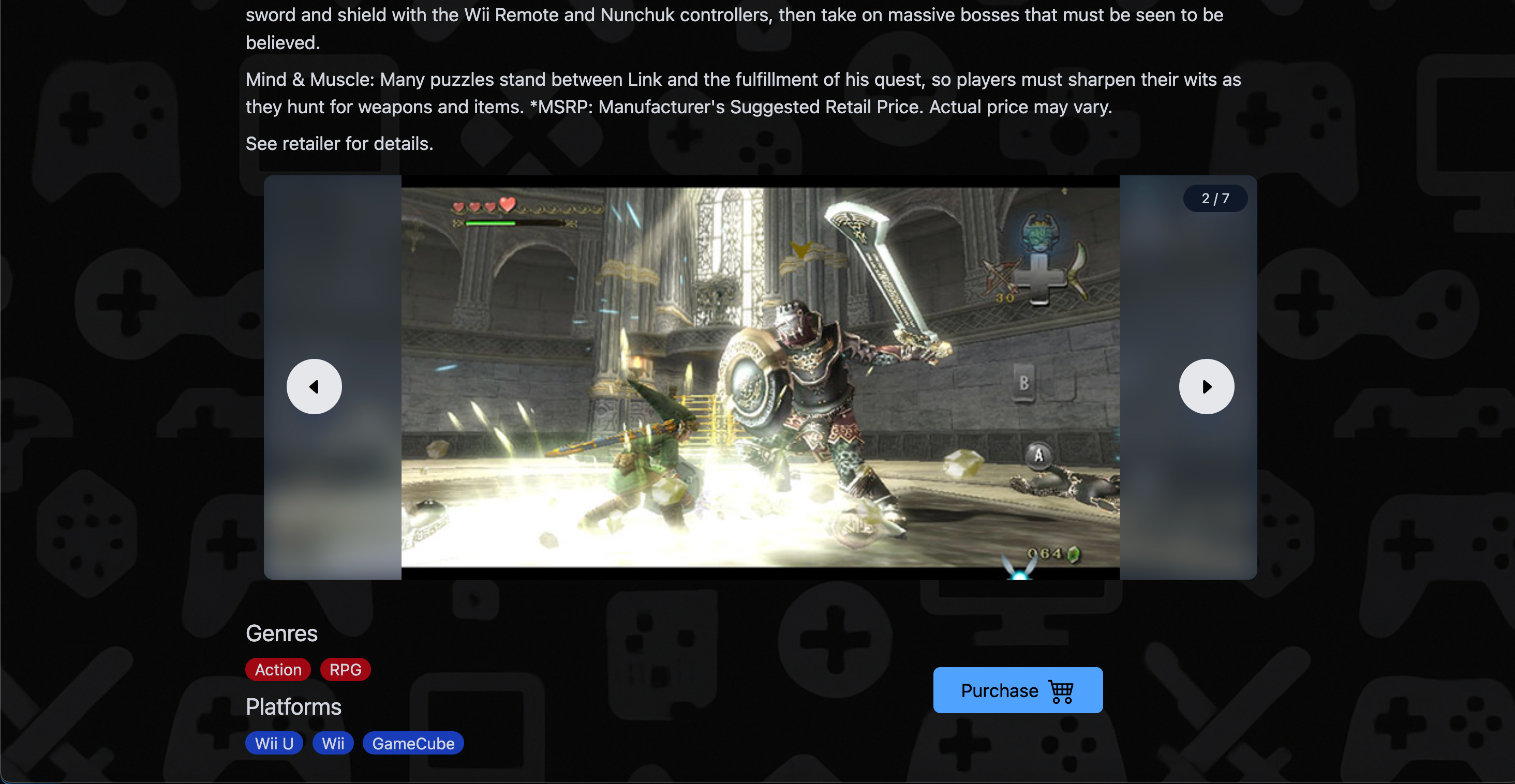
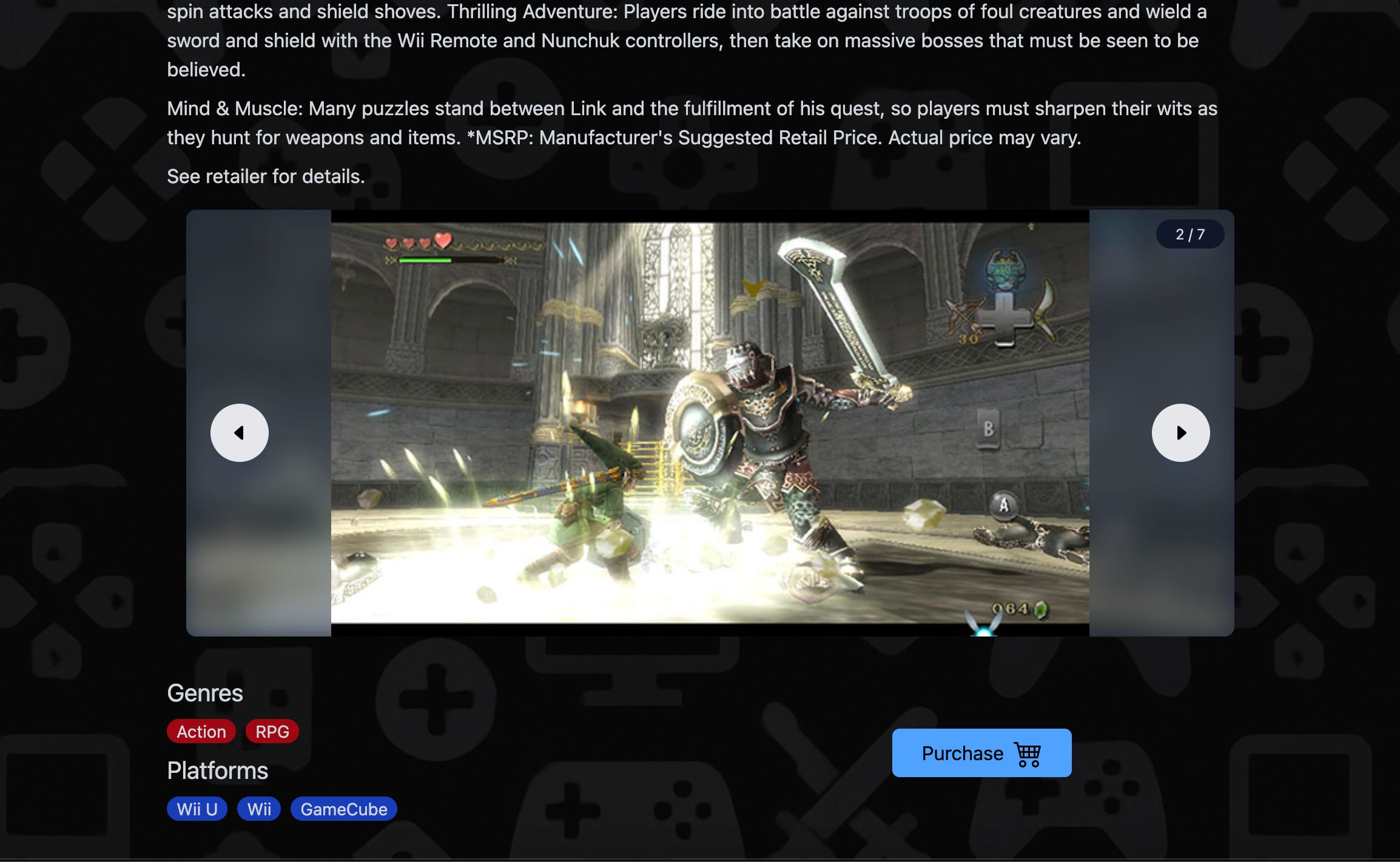
<div className="w-full flex flex-col items-center p-4 h-96">
  {currentGame.short_screenshots.length !== 0 && (
    <ScreenshotCarousel
      screenshots={currentGame.short_screenshots.slice(0)} // exclude the first screenshot since it's the same as the cover
    />
  )}
</div>
Now, if you run the project, you should get the following.
Conclusion
You have finished your first React project! I have not touched on deployment (there are many different ways to go about it and plenty of tutorials online) and other React topics but I hope this was a good introduction.
Now that you have a basic foundation in React, you can start building your own projects and fill in your knowledge gaps using Google or taking a look at the official React docs.
You might be interested in game development? You can check out this next.
Learn The Basics of JavaScript and KAPLAY to Make Games Quickly

On my Substack, I usually publish tutorials teaching how to implement game mechanics in JavaScript using a library called KAPLAY.