How to Scale The Canvas While Preserving Aspect Ratio in p5.js
A Simpler CSS based approach
A while ago, I wrote an article explaining how to make a canvas retain its aspect ratio regardless of screen size in p5.js. For reference here’s the link.
Yesterday, I found a much better and simpler approach that involves writing a bit of CSS.
Let’s jump right into it.
Adding The Needed CSS Code
Assuming you have an index.html file with the following code :
<!doctype html>
<html lang="en">
  <head>
    <meta charset="UTF-8" />
    <meta name="viewport" content="width=device-width, initial-scale=1.0" />
    <title>Document</title>
  </head>
  <body>
    <script src="p5.min.js"></script>
    <script src="main.js"></script>
  </body>
</html>
add the following CSS in a style tag or a separate style.css file that you’ll then link back to the index.html.
You should have this.
<!doctype html>
<html lang="en">
  <head>
    <meta charset="UTF-8" />
    <meta name="viewport" content="width=device-width, initial-scale=1.0" />
    <title>Document</title>

    <style>
      body {
        margin: 0;
        height: 100vh;
        display: flex;
        align-items: center;
        justify-content: center;
        overflow: hidden;
      }

      canvas {
        width: 100%;
      }
    </style>
  </head>
  <body>
    <script src="p5.min.js"></script>
    <script src="main.js"></script>
  </body>
</html>
We first set the margins of the body tag to 0 so that the canvas can expand to the full viewport when needed. Otherwise, you would be left with a small gap between where the canvas ends and when the viewport ends.
Next, we set the height of the body tag to be of 100vh which stands for 100 viewport height units. 100vh = 100% of the viewport. We want our body tag to take all of the page’s height.
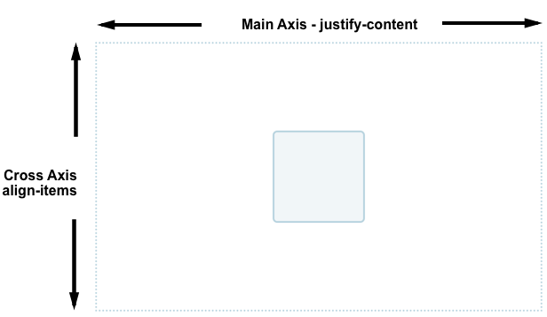
We then set the body tag to be a flex container by using display: flex. By default if the the flex-direction rule is not specified the flex container will have flex-direction: row set automatically. Finally, we use align-items: center and justify-content: center so that any elements within that flex container is going to be centered on the screen.
Here is a diagram coming from MDN Web Docs to help you understand the behavior of those two rules in our situation. Our flex container is only going to contain one element which is the canvas. It’s what represented by the blue square below.

The last rule for the body tag is to avoid having any scrollbars appear. We can achieve this by setting overflow: hidden.
The final rule needed is for the canvas width to be set to 100%. It’s important that we use 100% instead of 100 vw (viewport width units) because percentages are based of the space given by the parent and not the whole screen. We want the canvas to be constrainted by the body tag that contains it. Otherwise, the canvas will take too much space and users will have to scroll to view the rest of the canvas.
Adding The Needed JavaScript Code
Let’s assume that p5 setup code has already been written.
function setup() {

}

function draw() {

}
When creating the canvas in p5, the default styling set within the style attribute will have to be removed.
function setup() {
    const game = createCanvas(800, 500);
    game.canvas.style = "";
}

function draw() {

}
You can remove the current styling by simplying setting it to an empty string.
Now to test everything works let’s write some code to display text on the screen :
function setup() {
    const game = createCanvas(800, 500);
    game.canvas.style = "";
}

function draw() {
    background(220);
    textSize(80);
    text("This is a test", 50, 200);
}
Results
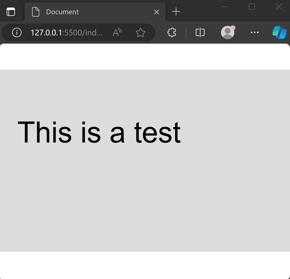
As you can see the canvas retain its aspect ratio regardless of the window’s size. This is known as letterbox scalling.
Thanks for reading through this article! Hope the content was useful to you. If you want more content related to JavaScript game development, subscribe down below :)


